Friday, 1 March 2019
Samsung Galaxy S10+ review
Launching around the globe a few days ahead of the world’s largest mobile show was the ultimate big-dog move. Samsung celebrated the 10th anniversary of its flagship phone line by launching its latest device on Apple’s sometimes-stomping grounds at San Francisco’s Bill Graham Civic Center.
The timing was less than ideal for all of us jet-lagged gadget reviewers, but the effect clearly paid off. Dozens of the world’s highest-profile reviewers have been roaming the streets of Barcelona with the S10 in hand and Galaxy Buds in ears. You couldn’t pay for that kind of publicity.
And, naturally, none of us minded testing those new photo features in one of Europe’s most beautiful cities.
But the 10th anniversary Galaxy arrives at a transitional time for Samsung — and the industry at large. The last couple of years have seen smartphone sales plateau for the first time since anyone started keeping track of those sorts of numbers, and big companies like Samsung and Apple are not immune.
That manner of existential crisis has led to one of the most eventful Mobile World Congresses in memory, as companies look to shake the doldrums of a stagnant market. It also led Samsung to open last week’s Unpacked event with the Galaxy Fold — first the cryptic product video and then the product unveil.
It’s a heck of a lead in, and, quite frankly, a recipe for disappointment. Here’s a look at the future, and now let’s talk about the present. Several people saw that I was carrying around a new Samsung device, got excited and were ultimately disappointed with the fact that I couldn’t unfold the thing.
None of this is any reflection on the quality of the S10 as a device, which I will happily state is quite high. But unlike the iPhone X, Apple’s 10th anniversary handset, the new Galaxy isn’t an attempt at a radical departure. Instead, it’s a culmination of 10 years of phone development, with new tricks throughout.
The Galaxy S10 doesn’t offer the same glimpse into the future as the Fold. But it does make a strong claim for the best Android smartphone of the moment. Starting at $1,000, it’s going to cost you — but if Samsung’s $1,900 foldable is any indication, smartphones of the future could make it look like a downright bargain.
Screen time
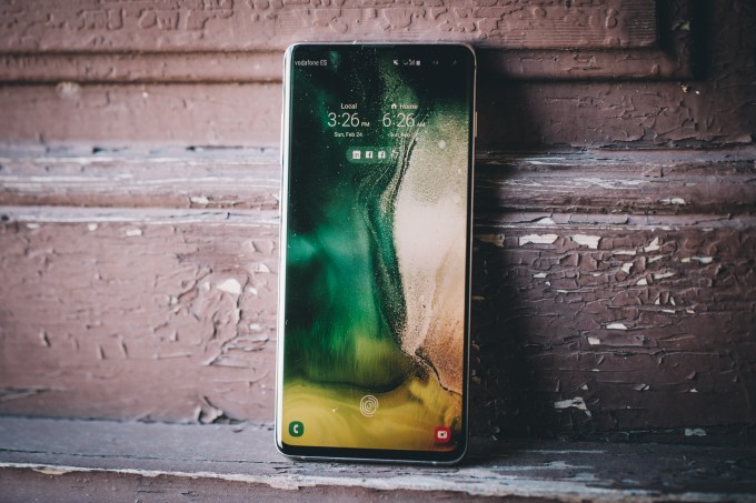
The Samsung Galaxy S10+ has been my daily driver for a week now. It joined me on an international road trip, through several product unveils from the competition and is responsible for all of the images in this post. Sometimes the best camera is the one in your pocket, as the saying goes.
Like other recent Samsung flagships, it’s going to be a tough device to give up when review time comes to a close. It’s a product that does a lot of things well. Tending, as Samsung often does, toward jamming as much into a product as possible — the polar opposite of chief competitor Apple’s approach.
But in the case of the Galaxy line, it all comes together very nicely. The S10 doesn’t represent a radical stylistic departure from its predecessor, maintaining the same manner of curved design language that helps the company cram a lot of phone into a relatively limited footprint, including a 93.4 percent screen-to-body ratio in the case of the S10+.
That means you can hold the handset in one hand, in spite of the ginormous 6.4-inch screen size. This is accomplished, in part, by the curved edges of the display that have been something of a Samsung trademark for a few generations now. It has also helped the Infinity-O design display, a laser cutout in the top-right of the screen, to fit the front-facing camera in as small a space as possible. In the case of the S10+, it’s more like an Infinity-OOO display.
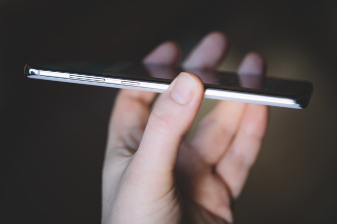
Samsung was going to have to give in to the cutout trend sooner or later, opting to go ahead and skip the whole notch situation. The result is a largely unobtrusive break in the screen. Just for good measure, the phone’s default wallpapers have gradually darkening gradients that do a good job obscuring the cut out while not in use.
But while the whole more-screen-less-body deal is generally a good thing, there is a marked downside. I found myself accidentally triggering touch on the sides of the display with the edge of my palms, particularly when using the device with one hand. This has been a known issue for some time, of course.
Oh, and there’s one more key aspect in helping the S10+ go full screen.
Putting your finger on it
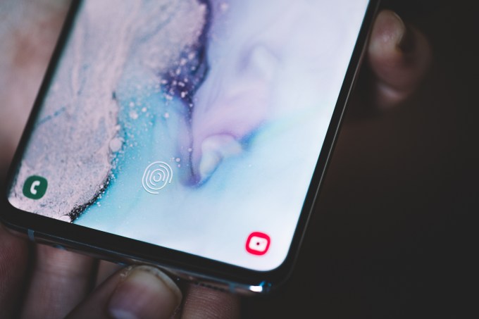
As with many of the features here, Samsung can’t claim to be the first to have the under-display fingerprint sensor. OnePlus, in a rare push to be first to market, added a similar technology to the 6T, which arrived last fall. But Samsung’s application takes things a step further.
The S10 and all of its variants are among the first to implant the fingerprint technology that Qualcomm announced at its Snapdragon Summit in Hawaii last year. The key differentiator here is an extra level of security. If the OnePlus’ fingerprint sensor is akin to your standard face unlock, this is more in line with what you get on the iPhone or LG’s latest handset.
The ability to sense depth brings another layer of security to the product — quite literally. Here’s how Qualcomm describes it:
Combining a smartphone’s display and fingerprint reader for a seamless and sleek look, 3D Sonic uses technological advances and acoustics (sonic waves) to scan the pores of a user’s finger for a deeply accurate 3D image. An ultra-thin (0.2 mm) sensor enables cutting-edge form factors such as full glass edge-to-edge displays, and can be widely used with flexible OLED displays.
Setup proved a bit fussier than the standard physical fingerprint button. Once everything is squared away, the reader is actually fairly responsive, registering a rippled water animation and unlocking the phone in about a second.
Getting your finger/thumb in the right spot might take a couple of tries on the first go, but after that, it’s muscle memory. There’s also a small fingerprint shaped guide that pops up on the lock screen for help. It can still be a bit tricky for those times you’re not looking directly at the display, or if you switch between hands.
It’s also worth noting that the unlock can be tricky with some screen protectors. Samsung will be working with accessory manufacturers to design compatible ones, but picking the wrong company could severely hamper the unlock function.
In some ways, though, the in-display fingerprint reader beats face unlock. I tend to lay my device down next to my keyboard when I work. Lifting the phone up to my eyes in order to read notifications is a bit of a pain. Same goes for when I need to check messages in bed. Here you can simply touch, check the notifications and go on with your life.
Ports in a storm
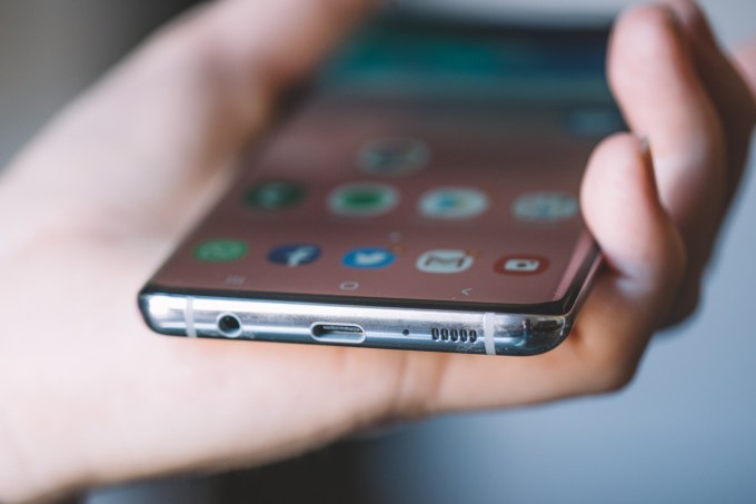
Around the edge is a mirrored metal band that houses the power button on one side and volume rocker and devoted Bixby button on the other. Yes, the Bixby button is back. And no, it won’t be going anywhere anytime soon. Samsung is wholly devoted to the smart assistant, and the company’s mobile devices are the one foothold Bixby currently commands.
The complaint about the Bixby button mostly stems from the fact that the assistant was, quite honestly, pretty useless at launch — particularly when compared to Android’s default assistant. In fact, when Google announced this week at Mobile World Congress the upcoming arrival of Assistant buttons on third-party devices, the news was generally welcomed by the Android crowd.
Samsung, meanwhile, gets hounded about the Bixby button, as though its inclusion is a way of forcing its assistant on users. Once again, Samsung relented, giving users the ability to remap the button in order to launch specific apps instead. This has played out time and again with the last several Galaxy devices.
The fact is, after an admittedly rocky start, Bixby has slowly been getting better, feature by feature. But the assistant still has catching up to do with Google’s headset, and frankly doesn’t offer a ton of reasons to opt into it over Android’s built-in option. Samsung has certainly made big promises of late, coupled with the imminent arrival of the Galaxy Home Hub.
Of course, that device was announced more than half a year ago, and when it does finally arrive, it will likely be carrying a prohibitive price tag. Beyond that, Bixby is currently the realm of things like Samsung refrigerators and washing machines. None of this adds up to a particularly compelling strategy for a multi-million-dollar AI offering that has become something of an inside joke in the industry.
But Samsung sticks to its guns, for better or worse. Sometimes that means Bixby, and sometimes that means defiantly clinging to the headphone jack. Turns out if you avoid a trend for long enough, you can become a trendsetter in your own right — or at least a respite from the maddening crowd.
It’s been a few years since the beginning of the end came for the jack, and the whole thing still leaves plenty of users with a sour taste. Even the once-defiant Google quickly gave in and dropped the jack. Samsung, however, has stood its ground and the decision has paid off. What was ubiquitous is now a differentiator, and even as the company hawks another pair of Bluetooth earbuds, it’s standing its ground here.
All charged up
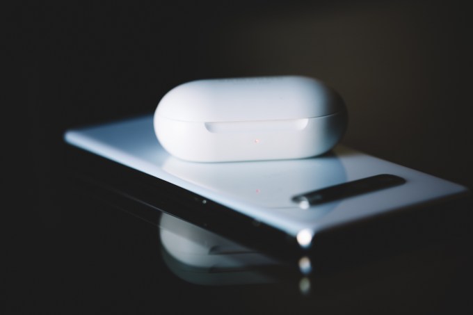
The back of the device, like the front, is covered in Gorilla Glass 6. The latest from Corning, which debuted over the summer, promises to survive “up to 15 drops.” But don’t try this at home with your shiny new $1,000 smartphone, as your results may vary.
The material also helps facilitate what is arguably the device’s most compelling new feature: Wireless PowerShare. Samsung’s not the first company to roll out the feature — Huawei introduced the feature on the Mate 20 Pro last year. Still, it’s a cool feature and, perhaps most importantly, it beat Apple to the punch.
The feature needs to be activated manually, by swiping down into notifications (it will also automatically shut off when not in use). From there, tapping Wireless PowerShare will pop up a dialog box, letting you know the feature is ready to us. Turn the phone face down on a table and place a compatible phone on top, face up, and the S10 will go to work charging it.
Placement can be a bit tough to get right the first couple of times. The trick is making sure both devices are centered. Once everything is where it should be, you’ll hear a quick notification sound and the phone will register as charging. In the case of the new Galaxy Buds, the sound is accompanied by the appearance of the case’s charging light.
It’s a neat feature, for sure. I can certainly imagine lending some ill-prepared friend a little juice at the bar one night. I wouldn’t go throwing out my power bank just yet. For one thing, one of the phones needs to be face-down the whole time. For another, wireless charging isn’t nearly as fast as its wired counterpart, so beyond the initial novelty of the feature, it may not ultimately be one you end up using a lot.
And, of course, you’re actively draining the battery of the phone sharing power. It’s a little like a Giving Tree scenario, albeit with the lowest stakes humanly possible. Thankfully, the handsets all sport pretty beefy batteries. In the case of the S10+, it’s a massive 4,100 mAh (with the 5G model getting an even nuttier 4,500 mAh).
It’s clear the days of Samsung’s Note 7-induced battery cautions are well behind it, thanks in no small part to the extensive battery testing the company implemented in the wake of a seemingly endless PR nightmare. As it stands, I was able to get around a full day plus two hours with standard usage while roaming the streets and convention center halls of Barcelona. That means you shouldn’t have to worry about running out of energy by day’s end — and you may even have a bit to spare before it’s all over.
Camera ready
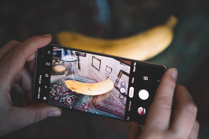
You know the drill by now, Samsung and Apple come out with a new flagship smartphone, which quickly shoots to the top of DxOMark’s camera ratings. The cycle repeats itself yet again — with one key difference: It’s a three-way tie.

[Left: Standard, Right: Full zoom]
Really, there’s no better distillation of the state of the smartphone industry in 2019 than this. The latest iPhone, which is now half-a-year-old, is now a few spots down the list, with Samsung in a three-way tie for first. The other two top devices are, get this, both Huawei handsets. It’s been a banner year for the Chinese handset maker on a number of fronts, and that’s got to leave the Apples and Samsungs of the world a bit nervous, all told.
[gallery ids="1790609,1790610,1790611,1790612,1790613,1790614,1790615,1790617,1790618,1790619,1790620,1790621,1790622,1790623,1790624,1790625,1790626,1790627,1790628,1790629"]
For now, though, there’s a lot to like here… 109 points’ worth, in fact. The last several generations of camera races have resulted in some really well-rounded camera gear. It’s a setup that makes it difficult to take bad shots (difficult, but hardly impossible, mind), with the combination of hardware and software/AI improvements we’ve seen over the course of the last few devices.
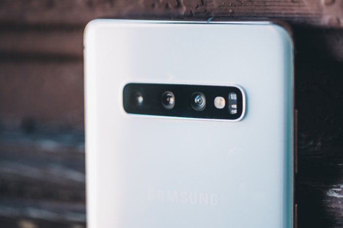
The camera setup varies from device to device, so we’re going to focus on the S10+ — the device we’ve spent the past week with (though, granted, the 5G model’s camera warrants its own write-up). The plus model features a three-camera array, oriented horizontally in a configuration that brings nothing to mind so much as the original Microsoft Kinect.

[Left: Samsung S10+, Right: Pixel 2]
It’s been fascinating watching companies determine the best use for a multi-camera array. Take Nokia’s new five-camera system, which essentially compiles everything into one super-high-res shot. Here, however, the three lenses capture three different images. They are as follows:
Wide (Standard): 12 MP, 26mm
Telephoto: 12 MP, 52mm
Ultrawide: 16 MP, 12mm

The system is configured to let you seamlessly switch between lenses in order to capture a shot in a given situation. The telephoto can do 2x shots, while the ultrawide captures 123-degree shots. The 5G model, meanwhile, adds 3D-depth cameras to the front and rear, which is a pretty clear indication of where Samsung plans to go from here.

That said, the current setup is still quite capable of pulling off some cool depth tricks. This is no better exemplified than with the Live Focus feature, which applies a Portrait Mode-style bokeh effect around the objects you choose. The effect isn’t perfect, but it’s pretty convincing. Above is a shot I took on the MWC show floor and used in the led for a story about the HTC Vive.

There are some fun tricks as well, like the above Color Point effect. I’m not sure how often I’d end up using it, but damn if it doesn’t look cool.

All of that, coupled with new touches like wide-image panorama and recent advances like super-slow-motion and low-light shooting make for an extremely well-rounded camera experience. Ditto for scene identification, which does a solid job determining the differences between, say, a salad and a tree and adjusting the shooting settings accordingly.
![]()
Oh, and a low-key solid upgrade here are the improved AR Emojis, as seen above. They’re 1,000 times less creepy than the originals. I mean, I’m still not going to be sharing them with people unironically or anything, but definitely a step in the right direction.
Today’s Galaxy
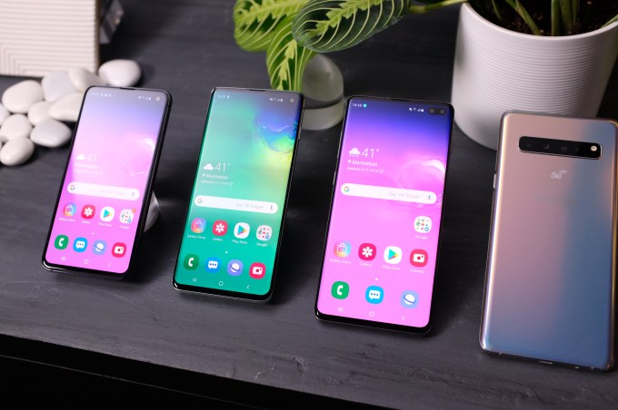
The present moment is an exciting one for the mobile industry. There were glimmers of promise all over the MWC show floor and a week prior at Samsung’s own event. A stagnant industry has caused the big players to get creative, and some long-promised technologies are about to finally get real.
The Samsung Fold feels like a clear peek into the future of one of the industry’s biggest players, so it’s only natural that such an announcement would take some of the wind out of its flagship’s sails.
The S10 isn’t the smartphone of the future. Instead, it’s the culmination of 10 solid years of cutting-edge smartphone work that’s resulted into one of today’s most solid mobile devices.
from Mobile – TechCrunch https://ift.tt/2IYoJVp
via IFTTT Tags: IFTTT , Mobile – TechCrunch


0 Responses to “Samsung Galaxy S10+ review”
Post a Comment